Dying Fast and Slow - Part 2
Unexplained Patterns of Immediate and Delayed Mortality after Covid-19 Injections Across the United States.
Part 1 can be found here.
What happened in South Dakota and Kentucky?
When my colleagues and I analyzed VAERS data for mortality reports after Covid-19 injections at the end of 2021, we have identified 2 distinct patterns: “fast” mortality, primarily due to cardiovascular causes occurring within 1-2 weeks after “vaccination”, and a “slow” pattern where the deaths began spiking again after 100 days post injection and reached a second peak around 180 days. The second peak was driven primarily by post vaccination deaths from covid. Note that the examined population is 100% vaccinated, and therefore all covid cases were, at a minimum, “vaccine” failure. As explained in the Part 1, it is more appropriate to categorize them as the injection-induced antibody-enhanced covid disease. Change my mind.
We found that this delayed mortality very unusually was present predominantly in only a few US states and those same states were very significant outliers with respect to the post-injection deaths per 100,000 injected people.
I decided to revisit my previous analysis with updated data from VAERS as of July 8, 2022. Additional 6 months of data revealed the same two patterns of mortality, and some new insights. Figure 1 below shows deaths by day after “vaccination” for each state in the US. The first box is for VAERS reports that do not have a US state identified. Note that death reports in VAERS are significantly under-reported, historical estimates range 40-100x, but can be much higher. For example, when non-death reports are compared between VAERS and vSAFE (phone app reporting post injection), there is a 1000x under-reporting of severe adverse reactions requiring hospital visits by VAERS.
Figure 1.
The overall picture shows even more alarming patterns as 6 months ago – very large increase of the reported deaths across all states, almost doubling from 6700 at the end of 2021 to 11,700 today. Approximately half of the deaths (~5000) are with the date of onset >120 days, and the majority of those have covid illness as the primary symptom. Even more alarming however, these are not equally distributed across the US states! I have circled some outlier states: SD, KY, TN, TX, WI, MI, however FL, GA, MT and MO should also be examined. They all have higher than expected mortality, and additionally exhibit substantial delayed mortality pattern over time – greater proportion of death reports with days to onset >100 days. Most states do not demonstrate the same pattern, with immediate mortality post jab dominating the total reported deaths.
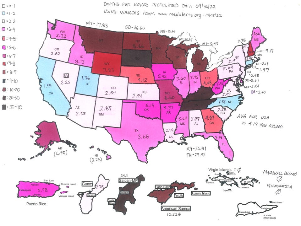
The most confusing is South Dakota: within a period of 6 months deaths reported in that state jumped from 36 to 231 – a nearly 10x increase! Almost all of these are from “delayed” deaths by covid. More concerning still, the rate of deaths per 100,000 injected people in a state is widely different across the United States (Figure 2), and South Dakota and Kentucky are by far the worst on this metric, with 33 and 24 deaths per 100k injected, respectively.
Figure 2 (by Douglas O’Connor).
Below (Figure 3) is a bit different data cut – total deaths by the number of people vaccinated – reveals that while the deaths are generally related to the number of injections, the variability of this effect across different states is very large. Some states are very significant outliers, having multiple times more deaths than would be expected by the statistical relationship. For example, Tennessee, Kentucky, and Michigan all have more deaths reported than California, while having only about 1/10 of the injected number of people. Interestingly, these products appear so dangerous that a linear regression model of deaths vs jabs tells us that just by having the Covid-19 “vaccination” program available in a state, one should expect 88 people dead from it (intercept), with a 95% CI of 26-150 deaths. This is of course a retrospective fit and likely a result of the heterogeneity of the underlying data – one linear regression model may not be sufficient to explain it.
Figure 3.
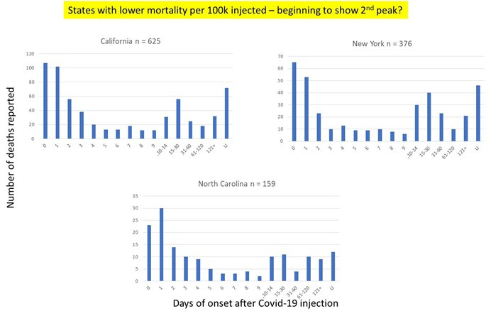
In some states the mortality picture is far less bleak, and in fact they are outliers in the opposite direction. California, New York, and North Carolina are reporting lower rates of deaths relative to the numbers of vaccinated population. Note that in the context of the absolute carnage inflicted by these injection products, “lower” mortality is still orders of magnitude higher than, prior to 2020, would have qualified for a complete recall of these products from market. Nevertheless, when the 2 groups of outliers (high mortality vs low mortality states) are examined, they show a qualitatively different pattern over time – the states that have reported extremely high deaths have almost all of these coming from the “slow” deaths due to covid illness 100+ days after injections, while the group of low mortality states has a much more equal distribution of deaths over time (Figure 4). Interestingly, California had almost no “late” deaths 6 months ago, but some are emerging now (Figure 5). This is worth revisiting in another 6 months.
Figure 4. Mortality Patterns by Day of Onset in the States with Greater than Expected Total Deaths, Adjusted for “Vaccinated” Population.
Figure 5. Mortality Patterns by Day of Onset in the States with Lower-than-Expected Total Deaths, Adjusted for “Vaccinated” Population.
Discussion:
The patterns revealed in this analysis are unusual, alarming, and inconsistent with a safe pharmaceutical product manufactured in compliance with the current Good Manufacturing Practices (cGMP) and other relevant quality requirements. What is going on in South Dakota, Kentucky, and a few other states with skyrocketing death-by-jab rates? There can be VAERS reporting differences state by state, however, since the reports are submitted by both healthcare professionals (doctors, nurses, pharmacists) and general public, and there are no state level differences as to how reports are submitted it is difficult to imagine what would produce such large differences in the reporting, especially when reporting mortality 100+ days post injection. More importantly, are all states getting the same product formulations or the same product batches? My previous analyses of VAERS by lot number (which I will republish here in the next few weeks) as well as review of documents made available by court order from Pfizer and Moderna has indicated very high likelihood that these products are fraudulent and adulterated, containing de-facto different formulations with lax to nonexistent control of the declared ingredients and massive amounts of impurities allowed by the regulators.
If the product formulations across batches shipped to different state are substantially different (as my other analyses have shown), then more complex statistical functions may be needed to explain the underlying relationship. Two patterns of death point to at least two types of toxicities inherent in the formulations.
We will likely never hear a response from a “health authority” or the product manufacturers on these questions, as they are too busy destroying any traces of credibility they might have ever had on that matter. Denial and cover-up are expected to continue for the foreseeable future.
Update as of October 2022:
I asked Douglas O’Connor to provide an updated map of post-injection mortality per 100K injectees by the US states later in 2022. The differences in the post-injection death rates across the states did not equalize - South Dakota is still the grim leader in post-injection mortality, and the rate went up to ~37/100K (from 33/100K earlier in the year). Kentucky is close second.
Douglas has performed a forensic analysis of the VAERS reports, identifying specific writing styles of the CDC "writers” (ahem, their cover-up and manipulation squad of private contractors), and is often able to recover the missing information about the locations and other details that are often removed from reports by CDC. Using his approach, he arrives at extremely concerning and high rates of deaths post injections, especially for the US island territories (Northern Mariana Island exhibits quite terrifying mortality of 100-140 deaths per 100K injected).
Art piece for today: At the Hunt, oil on panel, 18 x 24 inches.


With all the grimness going on, I appreciate you treating us to your amazing art work, Sasha.
Sasha, I just recently discovered you, and am glad I did. Your knowledge and perspective as a former pharma exec (I am, too) carry a lot of weight. Question for you on the imbalance of VAERS reports by state: Do you not think that the political climate and belief in the narrative can be so strong in the outlier deep blue states that providers/patients there would not dare attribute an AE to the vaccine and thus never report it, especially if further out on the timeline? My feeling is that the cultural differences are so significant that they could account for at least some of the variance.